Twelve Inches of Pure Art: The 1979 Album Covers That Turned Record Stores Into Galleries
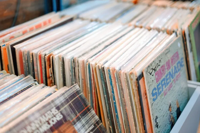
There was a ritual to buying a record in 1979. You walked into the shop, flipped through the bins, and sometimes—sometimes—an album cover reached out and grabbed you by the collar before you'd heard a single note. The music hadn't played yet, but you already knew. You were buying it.
That's a sensation that streaming has quietly murdered, and we're only just starting to grieve it properly.
In 1979, the 12-inch vinyl sleeve wasn't packaging. It was the opening argument. It was the first chapter. And in that one particular year, the art being produced for those cardboard squares hit a creative peak so high that looking back at it now feels almost unfair to everything that came after.
The Canvas Nobody Talks About
Let's be honest about something: album cover art has never really gotten the museum treatment it deserves. Critics spent decades writing about the music inside those sleeves while mostly ignoring the visual culture surrounding them. But in 1979, some of the most visually sophisticated work being produced in America and the UK was happening on 12.375-inch squares of cardboard.
Pink Floyd's The Wall, released in November of that year, didn't just have a cover—it had a concept. The stark white brick design by Gerald Scarfe was cold, institutional, and deeply intentional. It told you exactly what you were about to experience before the needle dropped. Collectors who track down original UK pressings will tell you that the texture of the sleeve itself, the weight of it in your hands, is part of the experience in a way that a 640-pixel thumbnail simply cannot replicate.
Across town (metaphorically speaking), Blondie was doing something entirely different with Eat to the Beat. Debbie Harry staring directly into the lens with that particular brand of bored confidence wasn't just a good photo—it was a visual manifesto. It said: we are cool, we know it, and we're not going to explain it to you. That cover launched a thousand punk-adjacent fashion choices in American high schools from coast to coast.
The Clash and the Art of Saying Everything at Once
If there's one album cover from 1979 that deserves a dedicated wing in a cultural museum, make a strong case for London Calling by The Clash. Pennie Smith's photograph of Paul Simonon smashing his bass guitar against the stage at the Palladium in New York City—shot in September of that year—became one of the most reproduced rock images in history. But it's the design choice that elevates it: that pink and green color scheme deliberately lifted from Elvis Presley's debut album, the scratchy hand-lettered font, the raw energy of the whole thing.
It was a cover that was simultaneously a tribute, a provocation, and a statement of intent. You couldn't scroll past it. You couldn't un-see it. And in 1979, you'd stare at it for the entire runtime of both vinyl sides because the record player demanded that kind of commitment.
Why Collectors Are Still Obsessed
Spend five minutes on any vintage vinyl forum today and you'll find heated arguments about original pressings versus reissues that would baffle anyone under thirty. Why does it matter if the matrix numbers in the dead wax match a specific pressing plant? Why pay three times the price for a cover that's technically identical to the reissue?
Because it's not identical. Not really.
Original 1979 pressings carry a specific weight of paper, a particular ink saturation, sometimes gatefold designs with inner sleeves that included lyrics, photos, liner notes—entire secondary worlds tucked inside the main one. The Eagles' The Long Run, released in September 1979, came with artwork that rewarded close inspection in a way that no streaming service has ever bothered to replicate. The cover was a doorway, not just a label.
Record collectors aren't hoarders or nostalgics in the pejorative sense. They're archivists preserving a format that understood something fundamental: the presentation of art is itself an art form.
What Got Lost in the Download
When iTunes arrived and then Spotify after it, album artwork shrank to a postage stamp and then to an afterthought. Some artists stopped commissioning original cover art entirely. Others outsourced it to stock photo libraries or generated it with AI tools. The result is a streaming landscape where you'd struggle to pick most album covers out of a lineup twenty minutes after seeing them.
Compare that to 1979, when you could describe the cover of Supertramp's Breakfast in America to someone who'd never heard the album and they'd know exactly what you meant. That diner waitress holding the orange juice glass, the Manhattan skyline made of breakfast food—it was weird, specific, and completely unforgettable. It won a Grammy for Best Recording Package that year, because yes, there used to be a Grammy for that, and it was a serious award.
The Knack's Get the Knack, released in June 1979, deliberately aped the visual language of early Beatles records—black and white photography, clean typography—and the reference landed immediately because record buyers were fluent in the visual grammar of album art. That fluency has largely evaporated.
The Survivors and the Revival
Here's the quietly hopeful part of this story: vinyl never fully died, and neither did the art form attached to it. Record Store Day, which launched in 2008, has become an annual celebration that consistently sells out limited pressings with elaborate cover designs. Artists like Billie Eilish, Taylor Swift, and Kendrick Lamar have invested heavily in physical packaging for special editions, understanding that their most dedicated fans want something they can hold.
But those efforts, however genuine, exist in a different context. They're collectibles, not the primary delivery mechanism for music. In 1979, the album cover was the first thing everyone saw—not just the superfans who preordered the deluxe edition.
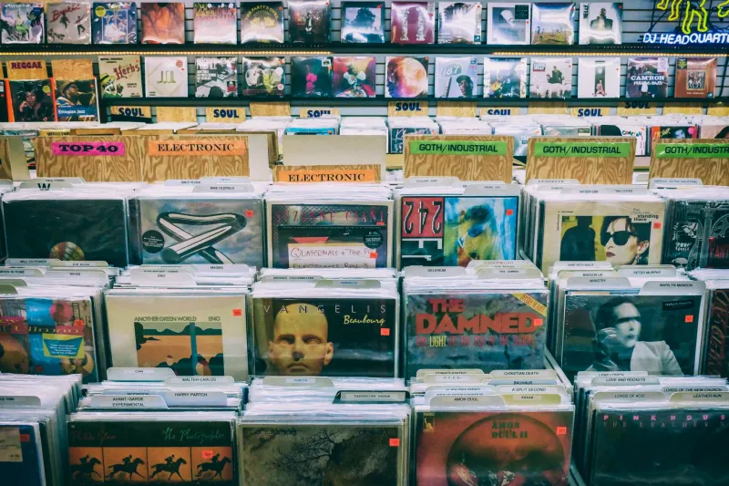
When you walk through a vintage record store today and flip through the bins, you're essentially browsing an uncurated gallery of 1979's visual culture. The covers of that year—the ones that stopped you, challenged you, made you laugh or feel uneasy or reach immediately for your wallet—represent something that existed at a specific intersection of technology, commerce, and artistic ambition that we're unlikely to see again.
Which is exactly why you should go find one, take it home, and actually look at it. Not thumbnail it. Look at it.
Twelve inches of cardboard. The most beautiful thing we almost forgot to miss.